This is an informative chart that definitely contributes to the discussion. Without any clue where it comes from, though, I have no way to gauge its credibility.
I’m curious on how that translates in population density? The US is (on average) a fair bit lower in density compared to other countries, and still had atrocious numbers for Covid
Since the meme mentions rate, rather than total deaths, this graphic from that article is probably more relevant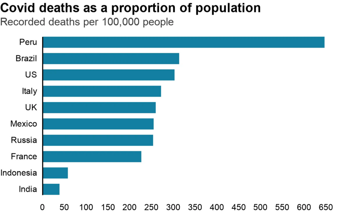
Mexico is smarter than republican America
This is an informative chart that definitely contributes to the discussion. Without any clue where it comes from, though, I have no way to gauge its credibility.
According to the article that this graphic came from, it’s from Johns Hopkins University, data as of 4 May.
I’m curious on how that translates in population density? The US is (on average) a fair bit lower in density compared to other countries, and still had atrocious numbers for Covid