I really don’t like the design of the progress pride flag, and I couldn’t really put my finger on it until I saw this: https://nava.org/good-flag-bad-flag
For reference, here is the flag I’m referencing as “bad flag”:

And here is the original:

So, the original has too many colors, but it’s the colors of the rainbow. In order. It’s recognizable from really far away, and it’s dead simple to draw.
With the Intersex flag, that’s 14 colors. There are three shades of “purple”. The circle won’t be visible from far away. The chevrons are too thin to be very recognizable from far away.
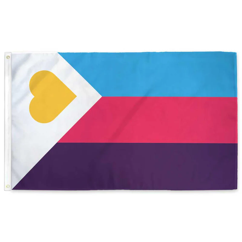
It’s not like there aren’t good pride flags. Like there are AMAZING ones:


Edit:
In case you don’t know what these are: https://flagsforgood.com/collections/pride-flags


Americans love to subdivide themselves, and that’s especially true for activists. The flag reflects that.
garbage opinion, you’re the kinda person that’d take issue with Black Lives Matter because you assume that implies white lives are inferior.
also, the progress flag is flown worldwide at Pride so you’re just spreading misinformation
Thank you for your opinion. I hope you have a pleasant day.