I really don’t like the design of the progress pride flag, and I couldn’t really put my finger on it until I saw this: https://nava.org/good-flag-bad-flag
For reference, here is the flag I’m referencing as “bad flag”:

And here is the original:

So, the original has too many colors, but it’s the colors of the rainbow. In order. It’s recognizable from really far away, and it’s dead simple to draw.
With the Intersex flag, that’s 14 colors. There are three shades of “purple”. The circle won’t be visible from far away. The chevrons are too thin to be very recognizable from far away.
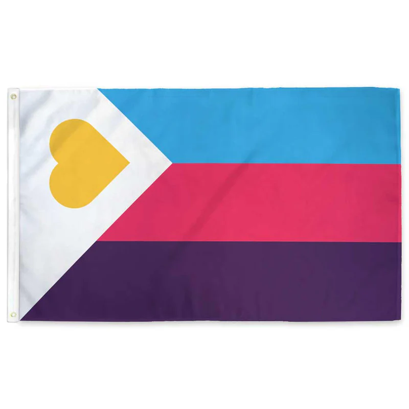
It’s not like there aren’t good pride flags. Like there are AMAZING ones:


Edit:
In case you don’t know what these are: https://flagsforgood.com/collections/pride-flags


The solution is inheritance. If you want a more specific flag, inherit from the rainbow, but add an insignia. Now you have a unifying flag that is more meaningful. Also you can skip the complexity of trying to make everyone stand out because the rainbow is all inclusive.
For example, I also like the pink triangle pirate flag. If you want a gay flag, take the rainbow and add that pirate insignia. Think like the US flag which is also a bunch of stripes but with some star insignia. Now you have one clear insignia on a field of inclusiveness
You’re right. Could literally design anything and people that know nothing about any of it could figure it out quickly. But instead, a salad of sex preferences, gender, race, kink, specific US cities, all appearing to be under the Intersex insignia.
It’s always seemed so bad to me that it’s more likely to be done by an anti-woke troll or someone like Michael Scott discovering Pride Month.
It’s just offensive. Obviously to the eyes, but also to any group being shoved together within its borders.