I really don’t like the design of the progress pride flag, and I couldn’t really put my finger on it until I saw this: https://nava.org/good-flag-bad-flag
For reference, here is the flag I’m referencing as “bad flag”:

And here is the original:

So, the original has too many colors, but it’s the colors of the rainbow. In order. It’s recognizable from really far away, and it’s dead simple to draw.
With the Intersex flag, that’s 14 colors. There are three shades of “purple”. The circle won’t be visible from far away. The chevrons are too thin to be very recognizable from far away.
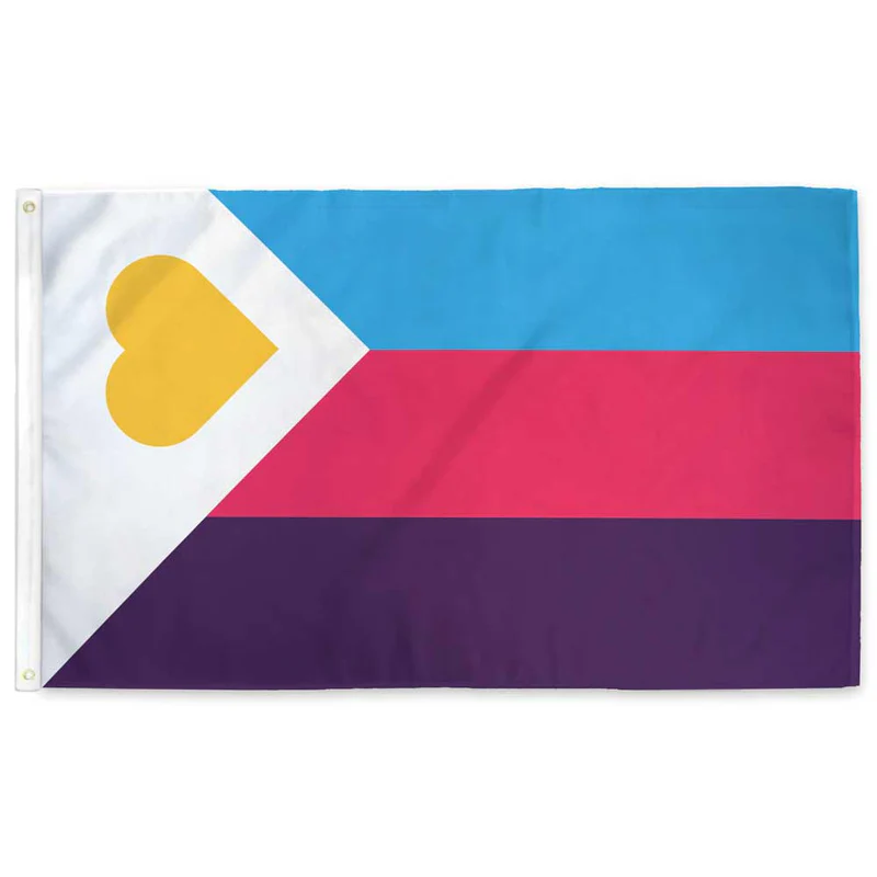
It’s not like there aren’t good pride flags. Like there are AMAZING ones:


Edit:
In case you don’t know what these are: https://flagsforgood.com/collections/pride-flags


I would absolutely and unironically fly this flag, although to be even more inclusive it also needs an alpha layer. Perhaps it should be a cube? Actually even that might not be inclusive enough, we need more dimensions. BRB I need to figure out how to attach a tesseract to my flagpole, I guess I’ll need some kind of gordian knot?
You need a hyperpole
But if you include alphas , you need to be inclusive of betas and sigmas, and other Greek letters still undefined
I was thinking more adding from outside the visible spectrum. So a flag with the entire electromagnetic spectrum from ~10^-20 m to ~10^17 m