I really don’t like the design of the progress pride flag, and I couldn’t really put my finger on it until I saw this: https://nava.org/good-flag-bad-flag
For reference, here is the flag I’m referencing as “bad flag”:

And here is the original:

So, the original has too many colors, but it’s the colors of the rainbow. In order. It’s recognizable from really far away, and it’s dead simple to draw.
With the Intersex flag, that’s 14 colors. There are three shades of “purple”. The circle won’t be visible from far away. The chevrons are too thin to be very recognizable from far away.
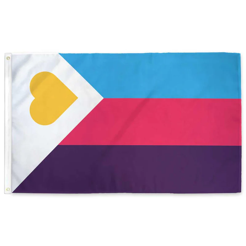
It’s not like there aren’t good pride flags. Like there are AMAZING ones:


Edit:
In case you don’t know what these are: https://flagsforgood.com/collections/pride-flags


I thought the rainbow was supposed to mean it encompassed everyone.
The colours on the flag apparently weren’t sufficiently inclusive so perhaps this should be the next flag:
God this website is just like reddit. Dumbasses just saying shit. No, the original Pride flag had 8 colors, and each color had a specific meaning. It wasn’t just “to encompass everyone.” Like what the hell, lemmy? Why are we doing bogus discourse on here too? Every year I gotta deal with a bunch of fucking straights dumping on the Progress Pride flag—seriously go fuck yourselves.
Each color had a specific meaning, but none of those meanings were a specific gender or sexuality. The meanings were intentionally tied to concepts, rather than to distinct groups of people. This was so it could encompass everyone. But then dumbasses started trying to claim specific colors as their own, which excluded people. And so then every group suddenly started making their own flags, since they were being excluded by the people claiming one of the colors on the rainbow.
this fails to capture the grades of saturation.
Here is every color in the RGB (#000000-#FFFFFF) color space arranged sequentially on a Hilbert curve (but scaled down to 512x512)
Why are there jpg compression artifacts in your png?
This gets my vote
coool
there are a lot of pieces that use one pixel per color too! you might really dig what people can do with it: it’s honestly astonishing the kinds of arrangements they can make just by mixing the colors.
https://allrgb.com/
I would absolutely and unironically fly this flag, although to be even more inclusive it also needs an alpha layer. Perhaps it should be a cube? Actually even that might not be inclusive enough, we need more dimensions. BRB I need to figure out how to attach a tesseract to my flagpole, I guess I’ll need some kind of gordian knot?
You need a hyperpole
But if you include alphas , you need to be inclusive of betas and sigmas, and other Greek letters still undefined
I was thinking more adding from outside the visible spectrum. So a flag with the entire electromagnetic spectrum from ~10^-20 m to ~10^17 m
Black and white are pretty overrepresented there though. Turning this into a sphere might help?
I call Lime Green as my personal inclusion color!!!
I literally lol’d!