I really don’t like the design of the progress pride flag, and I couldn’t really put my finger on it until I saw this: https://nava.org/good-flag-bad-flag
For reference, here is the flag I’m referencing as “bad flag”:

And here is the original:

So, the original has too many colors, but it’s the colors of the rainbow. In order. It’s recognizable from really far away, and it’s dead simple to draw.
With the Intersex flag, that’s 14 colors. There are three shades of “purple”. The circle won’t be visible from far away. The chevrons are too thin to be very recognizable from far away.
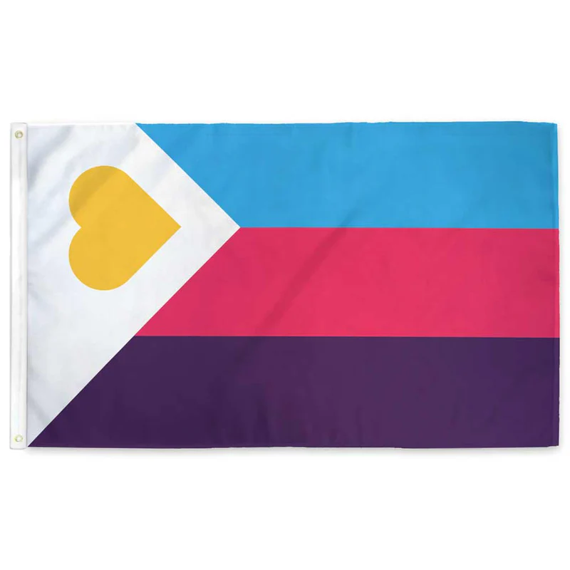
It’s not like there aren’t good pride flags. Like there are AMAZING ones:


Edit:
In case you don’t know what these are: https://flagsforgood.com/collections/pride-flags


God this website is just like reddit. Dumbasses just saying shit. No, the original Pride flag had 8 colors, and each color had a specific meaning. It wasn’t just “to encompass everyone.” Like what the hell, lemmy? Why are we doing bogus discourse on here too? Every year I gotta deal with a bunch of fucking straights dumping on the Progress Pride flag—seriously go fuck yourselves.
Each color had a specific meaning, but none of those meanings were a specific gender or sexuality. The meanings were intentionally tied to concepts, rather than to distinct groups of people. This was so it could encompass everyone. But then dumbasses started trying to claim specific colors as their own, which excluded people. And so then every group suddenly started making their own flags, since they were being excluded by the people claiming one of the colors on the rainbow.